CMH announces rebrand and 'new look for a new era'
Contact: Sarah Bello
Branding reflects health organization's commitment to safety and connection to nature, local area
ASTORIA, Ore. — Columbia Memorial Hospital is proud to announce a rebrand to CMH — a new look for a new era in health care — as it looks to the future and its hospital expansion, expected to be completed in 2027.
CMH partnered with Portland-based branding agency Sockeye to complete the rebrand process in 2024, along with a committee made up of patients, Marketing team members and leadership. The Board of Trustees approved the new look at their meeting in October 2024.
“Our previous logo and branding were introduced in 2006, so it was nearly 20 years old,” says CEO Erik Thorsen. “With the construction phase of the BuildCMH Expansion Project beginning, it is the perfect time to rebrand CMH and launch a new look that will enrich the expansion’s look and feel.”
Today, a refreshed website will go live, along with updated social media pages. Throughout 2025, patients will begin to see updates with signage, printed materials and digital presence.
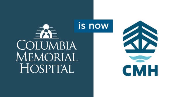
While the hospital itself will continue to be known as Columbia Memorial Hospital, the rebrand and primary logo emphasize the health system as a whole, including the CMH-OHSU Health Medical Group and the CMH-OHSU Knight Cancer Collaborative, as “CMH.” This change in naming convention reflects the organization’s clinics and services that have grown to be far more than “just a hospital.”
“This new look represents the same CMH and care that patients have come to know and trust,” says Sarah Bello, Marketing manager, “and yet, it’s a modern enhancement to bring us into the next generation of health care on the coast.”
About the new look
The rebrand was inspired by the beauty of the North Coast and its natural surroundings. The shield logo integrates the themes of nature, community and protection into a powerful symbol.
- The flowing water symbolizes both the Columbia River and the concepts of life and renewal.
- The Astoria-Megler Bridge not only gives a sense of place and identity but also represents community and connection.
- The fir tree stands for strength and growth, reflecting CMH’s deep roots in the area.
- The primary color palette of blues is inspired by the Columbia River and deep waters surrounding the North Coast, chosen to evoke feelings of calm, growth and harmony.
Together, these elements form a distinctive and meaningful look that embodies strength, safety and reliability.
Learn more about CMH and our plans for the future online at www.columbiamemorial.org.
FAQs about the rebrand
Q: Why is Columbia Memorial Hospital rebranding?
A: The previous logo, colors and style were introduced in 2006. With the construction of the hospital expansion, it’s a great time to launch a modern, new look that ties into the expansion facility’s updated look and feel.
Columbia Memorial Hospital has grown immensely over the past 20 years and offers many more services than “just a hospital,” including 17+ CMH-OHSU Health Medical Group clinics. The new naming convention to refer to the whole organization as “CMH” reflects this growth.
Q: What has changed with CMH’s rebrand?
A: Columbia Memorial Hospital and its 17+ clinics will now go by “CMH,” to describe the organization as a whole.
The rebrand also refreshes the “look” of CMH, with a new shield logo replacing the previous person/Columbia Memorial Hospital logo, along with new fonts and color palette. This new look will be reflected on patient materials, signage and CMH’s digital presence.
The new look represents the same CMH that patients have come to know and trust over the past nearly 100 years.
Q: Is the rebrand tied to new ownership?
A: Columbia Memorial Hospital remains an independent, not-for-profit hospital. We will continue our strategic partnership with Oregon Health & Science University, but there is not a new “owner” of the hospital.
Q: What does the new look mean?
A: The rebrand was inspired by the beauty of the North Coast and its natural surroundings. The new shield logo integrates the themes of nature, community and protection into a powerful symbol.
- The flowing water symbolizes both the Columbia River and the concepts of life and renewal.
- The Astoria-Megler Bridge not only gives a sense of place and identity but also represents community and connection.
- The fir tree stands for strength and growth, reflecting CMH’s deep roots in the area.
- The primary color palette of blues is inspired by the Columbia River and deep waters surrounding the North Coast, chosen to evoke feelings of calm, growth and harmony.
Together, these elements form a distinctive and meaningful look that embodies strength, safety and reliability.
Q: How will the rebrand affect me as a patient?
A: You will notice our new look on patient materials, signage and our digital presence online. Our official name, Columbia Memorial Hospital, remains the same, though we will more often refer to the whole organization as CMH. Our website address, www.columbiamemorial.org, and social media pages will stay the same, with the new, refreshed look.
Q: I received a bill in the mail that looks different. Is this legitimate?
A: Bills going out this spring may include a letter explaining the new look. The bills will look similar to what you have received previously but will include the new CMH primary logo. If you have questions about a bill, you can call Patient Financial Services at 503-338-7530.
Q: Who can patients direct questions to about the rebrand?
A: Please contact Sarah Bello, Marketing manager, at sbello@columbiamemorial.org.